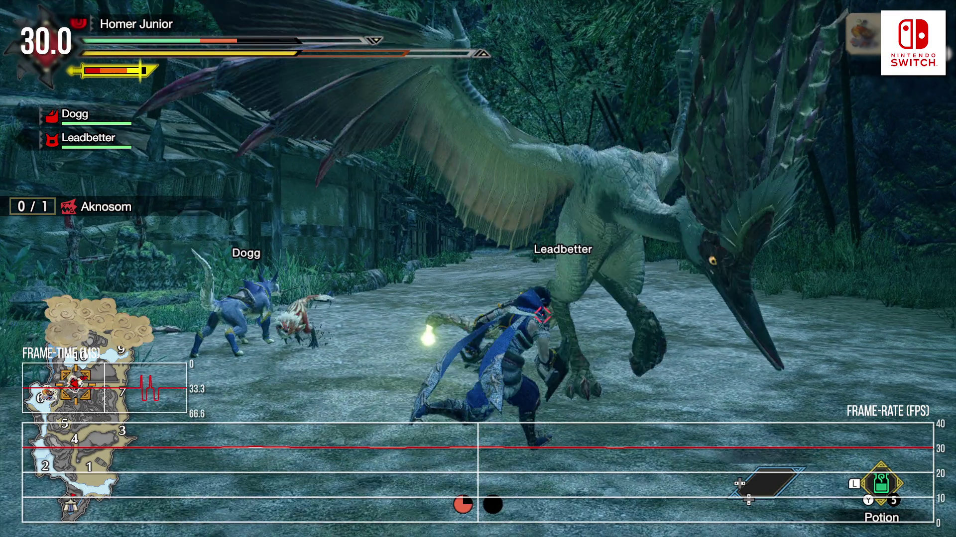
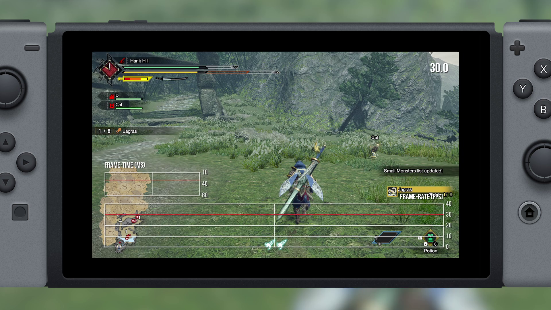
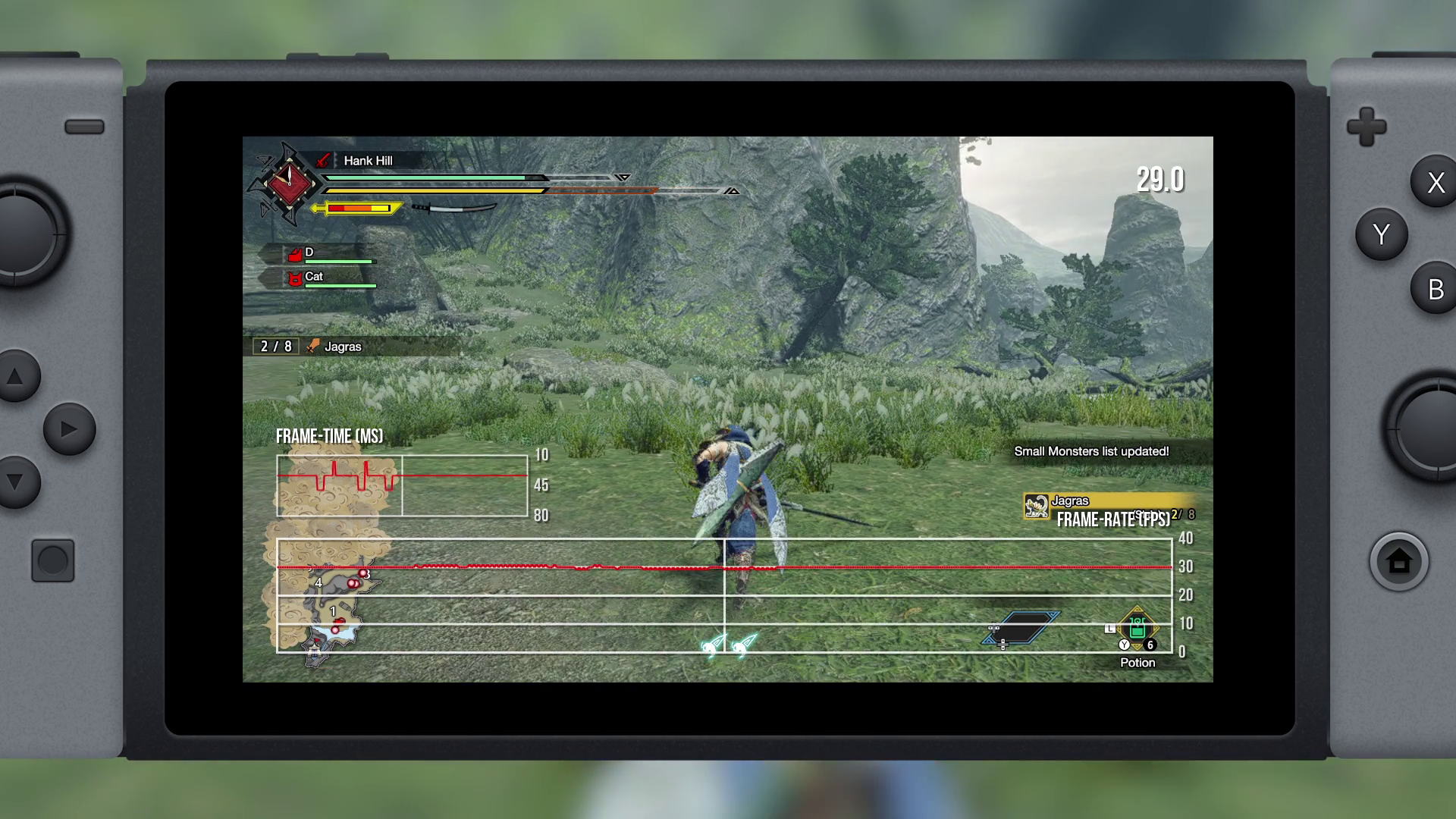
The series began life on PlayStation 2, though it found the greatest success on PSP, before transitioning to Nintendo platforms such as Wii, Wii U and 3DS and always followed a ‘segmented’ world design. Up until the arrival of Monster Hunter World, each area was broken up into a series of smaller, numbered maps. You would do battle with Monsters in these areas but they could move around the larger map where you could follow them through short loading screens. It worked but it always felt like a limitation put in place by the target hardware, which is why the arrival of Monster Hunter World represented a shift in design. By aiming for PlayStation 4, Xbox One and the PC, Capcom was able to build a more ambitious game in which individual arenas were no longer divided by loading screens - it would become a single, seamless world. Of course, the villages were still divided out, but once you entered each hunting area, it was open for exploration without loading. And this leads us up to the arrival of Monster Hunter Rise. It seems that simply porting World was never on the cards - Rise uses the new RE Engine rather than the older MT Framework, so what we get is a more bespoke experience seemingly built from the ground-up for Switch, but retaining the bigger open worlds. Put simply, the environments are huge and the new Wirebug mechanic allows you to traverse more of the map than any prior installment. You can reach areas that almost seem as if they shouldn’t be accessible, which makes for a more enjoyable traversal experience. The overall level of detail remains lower than Monster Hunter World, of course, and you’ll certainly note the ‘flat textured surface’ look in many areas due to limited foliage coverage, but it works overall. The much smaller village area is certainly one of the highlights with gorgeous use of distant scenery to lend what is a simple gameplay hub a beautiful aesthetic. And that’s delivered despite limited use of the RE Engine’s full feature set. That being said, ’limited’ doesn’t mean that features aren’t used at all. For example, bokeh depth of field is likely too computationally expensive for gameplay but does appear in engine-driven cutscenes. Image quality is acceptable but rather than different than your average modern-day release as its completely ignores temporal anti-aliasing in favour of a sharper but noisier look. In docked mode, pixel count suggests a fixed resolution of 1344x756 with edges producing a regular sample count of 21 out of 30 pixels. Due to the nature of the image, it’s easier to count than your typical modern game release. Portable mode drops this to 960x540 which is ever so slightly below the native resolution of the PS Vita screen. Regardless, it’s a nice-looking game - nothing mind blowing by today’s standards but it’s well-crafted for the target platform, and of course, that’s the point. And yes, cutbacks are inevitable and that starts with animation. Since the beginning, Monster Hunter has always focused on animation priority - that is, when you spin-up and attack, it takes time for the attack animation to play out. This requires careful timing in the larger battles to avoid taking damage but also makes for a game that some might describe as sluggish. The thing is, while I appreciate this design, something has always felt slightly off about the animation work - specifically locomotion. Walking up a hill sees feet clip into the environments, something that doesn’t happen in Monster Hunter World. There’s also a sense of extra weight in the walking motion in World thanks to additional bits and bobs dangling around on the character model. Thankfully, the rest of the animation is familiar - the attack animations seem to be directly based on Monster Hunter World, lining up perfectly in comparisons. So, overall, animation feels faithful to the prior game with just a few minor changes. It’s also worth looking at the scenery itself - Monster Hunter World presents relatively complex areas with lots of moving, animated foliage that also reacts to the player. Here, Rise matches the same spec, but there are no shadows attached to foliage, so the scene doesn’t feel as dynamic. Furthermore, the shadows that are included, such as tree shadows, are static in Monster Hunter Rise while they’re active in World. Water rendering also differs greatly - both games utilise screen-space reflections but the water surface shader and distortion below varies in quality. The flaws are present then, but they are the price we pay for a Monster Hunter game that retains the key advances made by Monster Hunter World. From what I can tell, the goal here was to build a game that retains the sense of scale and open design as Monster Hunter World, but to deliver it for a system that’s likely more challenging to work with. I feel that Capcom’s designers have been successful in this: the cuts made all make sense and do not distract from the game in a significant way. It’s a handsome looking game overall. Between this and the excellent Ghosts ’n Goblins Resurrection, the RE Engine has made a strong debut on Switch and it seems to be quite scalable. Not only that, but beyond visuals, Rise also offers a full 5.1 surround mix - something often omitted on the Nintendo platform. So, has it paid off? What we’d ideally want to see as a result of all of these changes is solid performance and actually, this is one area where Monster Hunter World was frustrating. While it’s buttery smooth on the latest consoles, the frame-rate was always unlocked and unsteady on the original last-gen systems. I had hoped for a 30fps cap option to stabilise the experience, but it never happened. I was, however, worried that this new Switch game could follow this trend - after all, even the 3DS games were unlocked. Thankfully, Capcom has made the right decision for the Switch hardware and capped the maximum frame-rate at 30fps. Based on gameplay from the first two major areas, I can safely say that the target frame-rate is reached most of the time. It’s almost always a steady 30fps during normal play with just small pockets of inconsistent frame-pacing. Portable mode is basically the same - a stable 30fps with occasional interruptions to fluidity. Based on what I’ve played this is the best-looking, most consistently smooth Monster Hunter experience I’ve had on a handheld console, but I should stress that in the pre-release period, I was not able to join any multiplayer games which means I could not test the game with multiple hunters running around. The other aspect of performance is, of course, loading and thankfully, this is also acceptable. Loading screens occur primarily when leaving or returning to the village and they’re rather quick at around 13 seconds. Once you arrive in the desired map, then, even fast traveling back to camp is instant. All told, I feel Capcom has done a commendable job in building this latest Monster Hunter instalment. The RE Engine scales well and the developers have struck the right balance with the technology in ensuring you get a good-looking game without tanking performance on the Tegra X1 processor. The right cuts were made and the game still looks great overall, even though certain sections can look a little plain at times. It seems that Capcom isn’t done with the game yet, and the mooted arrival of a PC version next year may yet see more of the RE Engine’s features deployed for a richer looking, smoother game. But in the here and now at least, Monster Hunter Rise is a recommended Switch purchase.


